Introducing Our New Logo

Blog / Global

Since our modest beginnings in 2014, Oddle has blossomed out and earned the reputation for being the trusted F&B business partner of choice in Southeast Asia today. We’ve effectively built a sustainable O2O ecosystem for the F&B industry by devising technological solutions to serve as the bridge between food makers and food lovers. Rooted in our “Always Restaurant First” philosophy, we are on the constant lookout to propel our vision of growing and equipping restaurants in an increasingly digital space. We’ve since expanded into 4 countries with over 3,000 F&B brands worldwide. As we strive for greater heights, we call for a re-evaluation of our identity and our purpose. We are now pleased to announce our brand new look!
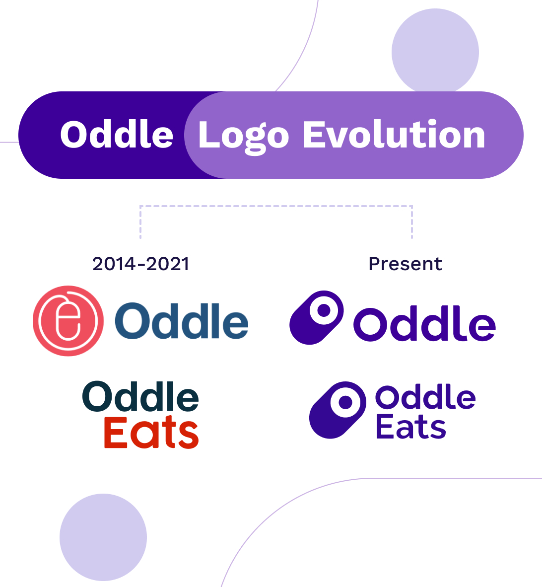
“Oddle's mission is to empower every restaurant to control its own future. Through our omnichannel platform, restaurants capture data from key customer touchpoints to personalise meaningful interactions and deliver unique experiences for each customer.”
- Jonathan Lim, Oddle's Chief Executive Officer

Swiping Up to Success
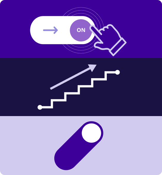
Our new logo is modelled after the way we activate an app. Sliding the button is the key to unlocking and opening up new opportunities with Oddle. Notice our brand colours, violet blue and navy blue – violet blue embodies creativity and innovation while navy blue exhibits integrity, highlighting our sophisticated, loyal, affable and thoughtful character. The white circle is the letter “O” which stands for Oddle, the enabler of business growth. What this means is that we make things happen.

The Oddle DNA — Enabler of Confident Business Growth

Upon a closer look, you will also realize that our new brand emblem resembles an oval shape in an upward movement. This represents the trajectory of Oddle’s business which is complemented by the modern and strong typeface to signify confidence in our offerings. Inspired by the form of the logogram which moves dynamically, our brand graphic element demonstrates progressiveness, movement, and pathway.

Oddle Eats Paving The Way for The Best Dining Experiences

The letter “O” also symbolizes Oddle Eats – our one-stop food discovery platform to connect customers to their favourite restaurants. Food lovers are empowered with a wider range of dining choices including delivery, self-pickup and reservations. This results in convenient and seamless dining experiences for our consumers. Setting itself apart with a tinge of playful and dynamic coral red against our primary violet blue and navy blue brand colours, we proudly display our passion and confidence in bringing the best dining experiences to our consumers.

Redesigning our brand logo is just the first step to our rebranding. We are excited for what the future holds as our merchants and customers swipe their way to success with Oddle’s Holistic F&B Tech Offering.

Introducing Our
New Logo

Blog / Global
05.03.2022
Since our modest beginnings in 2014, Oddle has blossomed out and earned the reputation for being the trusted F&B business partner of choice in Southeast Asia today. We’ve effectively built a sustainable O2O ecosystem for the F&B industry by devising technological solutions to serve as the bridge between food makers and food lovers. Rooted in our “Always Restaurant First” philosophy, we are on the constant lookout to propel our vision of growing and equipping restaurants in an increasingly digital space. We’ve since expanded into 4 countries with over 3,000 F&B brands worldwide. As we strive for greater heights, we call for a re-evaluation of our identity and our purpose. We are now pleased to announce our brand new look!

“Oddle's mission is to empower every restaurant to control its own future. Through our omnichannel platform, restaurants capture data from key customer touchpoints to personalise meaningful interactions and deliver unique experiences for each customer.”
- Jonathan Lim, Oddle's Chief Executive Officer

Swiping Up to Success

Our new logo is modelled after the way we activate an app. Sliding the button is the key to unlocking and opening up new opportunities with Oddle. Notice our brand colours, violet blue and navy blue – violet blue embodies creativity and innovation while navy blue exhibits integrity, highlighting our sophisticated, loyal, affable and thoughtful character. The white circle is the letter “O” which stands for Oddle, the enabler of business growth. What this means is that we make things happen.

The Oddle DNA — Enabler of Confident Business Growth

Upon a closer look, you will also realize that our new brand emblem resembles an oval shape in an upward movement. This represents the trajectory of Oddle’s business which is complemented by the modern and strong typeface to signify confidence in our offerings. Inspired by the form of the logogram which moves dynamically, our brand graphic element demonstrates progressiveness, movement, and pathway.

Oddle Eats Paving The Way for The Best Dining Experiences

The letter “O” also symbolizes Oddle Eats – our one-stop food discovery platform to connect customers to their favourite restaurants. Food lovers are empowered with a wider range of dining choices including delivery, self-pickup and reservations. This results in convenient and seamless dining experiences for our consumers. Setting itself apart with a tinge of playful and dynamic coral red against our primary violet blue and navy blue brand colours, we proudly display our passion and confidence in bringing the best dining experiences to our consumers.

Redesigning our brand logo is just the first step to our rebranding. We are excited for what the future holds as our merchants and customers swipe their way to success with Oddle’s Holistic F&B Tech Offering.